Taupe is an unusual color that’s hard to describe.
It’s a soft and sophisticated shade.
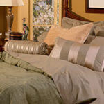
The color taupe is a soft, sensuous shade, but what exactly is it? It’s almost easier to say what it’s not.
It’s not cream. It’s not beige. It’s not white, and it’s not gray. It’s a neutral with tints somewhere between brown and gray, and it’s usually a little bit darker than other neutrals. Some people compare it to the color of a delicious mushroom bisque. And like different batches of mushroom soup, taupe can come in darker and lighter hues.
Think taupe for a more sophisticated shade of neutral.
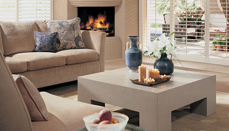
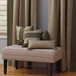
Taupe is a chic, sophisticated neutral that goes with almost any style of interior design. Most all shades of taupe go well with:
- greens, such as khaki and olive
- black
- other neutrals, such as white and cream
- chocolate brown
- gold
Some taupes have a pink or lavender undertone, and these shades go well with dark pinks and violets, such as burgundy and raspberry. Other versions of taupe have a cooler tone; and these go well with dark blues, aquas and teals. It’s smart to compare your taupe design elements with proposed purchases before you buy to make sure the colors complement each other.
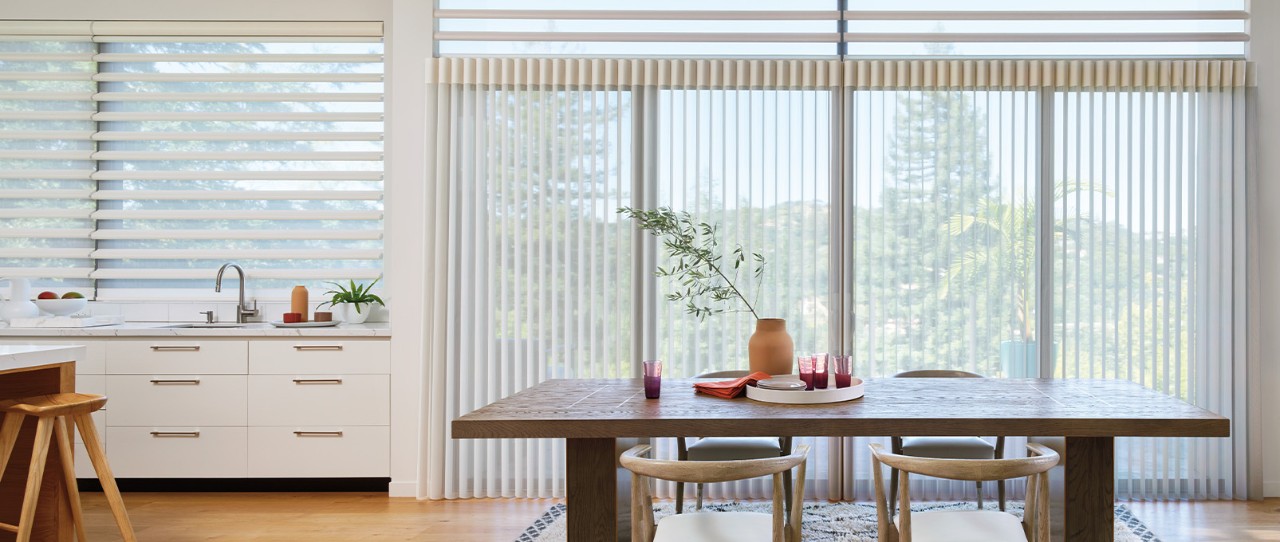
Think taupe for wall paint or an accent wall, window coverings, upholstery fabric, flooring, bed linens and more.
Consider the neutral taupe for a terrific addition to your interior look.
Copyright Hunter Douglas.