Chocolate is a bold and luscious interior design choice.
Just like the chocolate we love to eat, the color chocolate used in interior décor is dark, luscious and rich.
Chocolate is more than a delicious sweet treat!
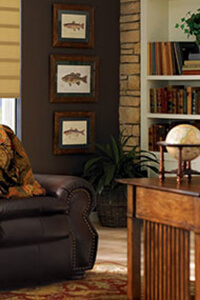
Chocolate is a bold color that can be used in a similar way as black, but with more interest and a bit of softness. This beautiful color can communicate high-style or it can be very warm and inviting, depending how you use it.
Chocolate is a bold and luscious interior design choice.
And chocolate can remind you of one of your favorite treats!
Just like edible chocolate, which we mix with everything from Rice Krispies to raspberries to hazelnuts to make it even tastier, decorative chocolate can be combined with a myriad of colors to enhance its beauty and flavor!
- Together with pastels, such as baby blue, light pink or butter yellow
- Layered with several lighter neutrals, such as cream, taupe, tan and beige
- Paired with snowy white
- Integrated with earth tones, like gold, apricot and sage green
- Combined with bold colors, such as tangerine, acid green or tomato red
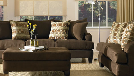
Like most dark colors, chocolate works best as an accent color rather than as the predominant color in a room. And it’s important to surround large areas of chocolate with light colors to ensure a room doesn’t appear too dark and closed. Consider these design elements for a touch of chocolate in your house:
- A painted accent wall
- Lacquer surfaces, such as table tops and furniture
- Rugs and carpeting
- Hardwood floors
- Fabrics for upholstery, draperies and headboards
- Table, bed and bath linens
- Leather or suede for wall coverings, furniture or table tops
- Tile, backsplashes and countertops in kitchen and bath
Think chocolate for decorating this year.
Copyright Hunter Douglas.
